Tennis Court Reveration Website
Role: PM / Design
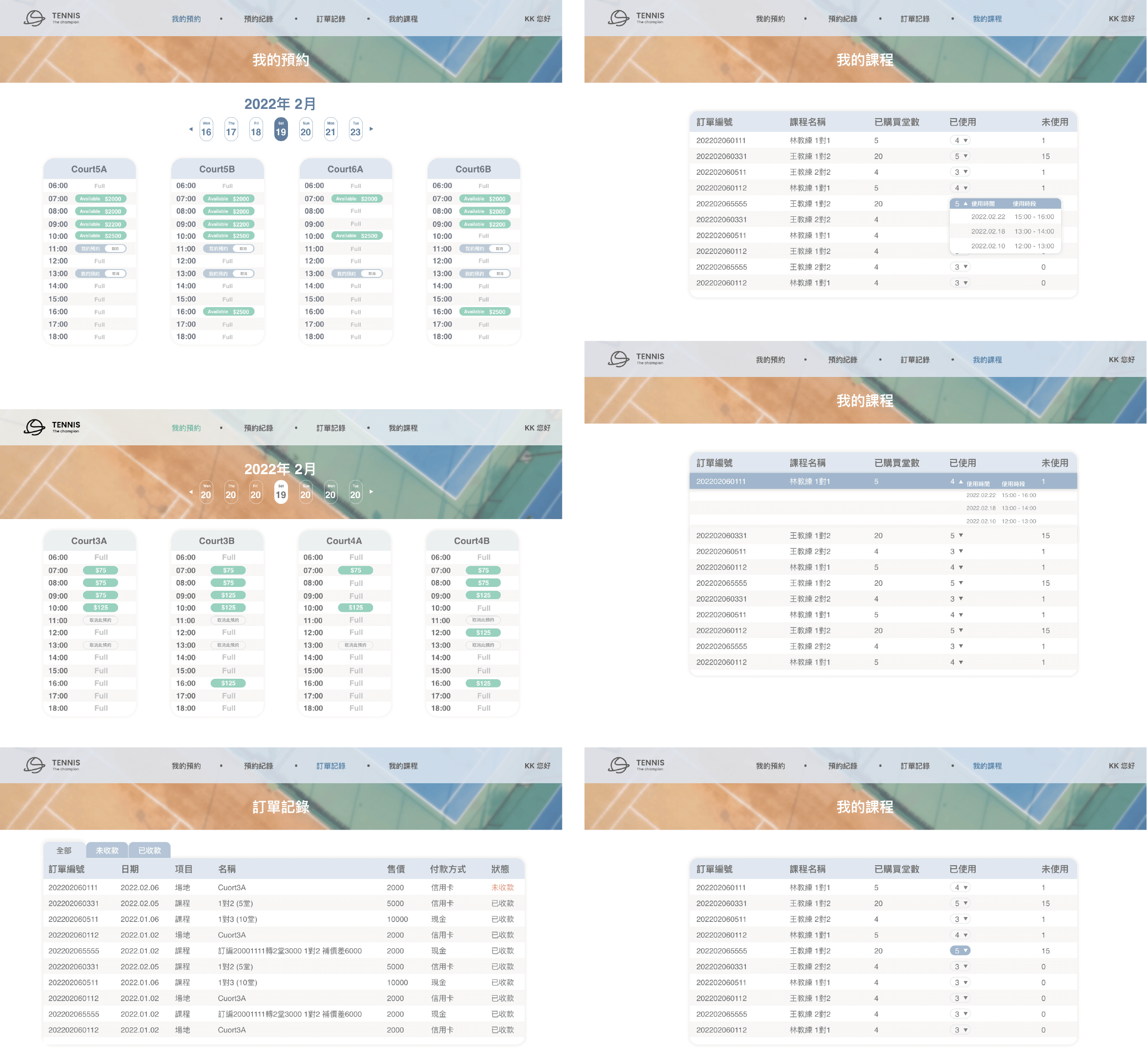
To develop a tennis court reservation website, we focused on creating a user-friendly interface that allows the general public to easily view available booking slots and their current reservation statuses. Given the vague requirements provided by the client during our initial meeting, we conducted comprehensive research on existing reservation platforms. Through this analysis, we identified common pain points in competitor sites, particularly the issue of poor readability in platforms that utilized shorter time slots. This issue often made it challenging for users to quickly grasp the availability status, and even more so to book or cancel reservations directly.
To address these concerns, we placed special emphasis on optimizing readability and user interaction within our development process. Our goal was to ensure that users could effortlessly understand the status of booking slots at a glance and interact with the reservation system smoothly, thereby enhancing the overall user experience on our tennis court reservation website.
Design
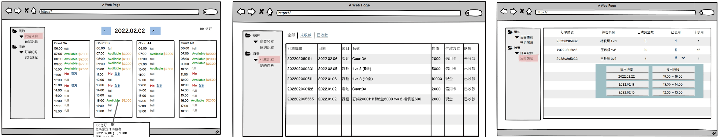
In designing the main reservation interface, I prioritized user clarity by enlarging the selected date box and employing effective color contrast. This design choice ensures users can effortlessly identify their chosen date. I selected green for the button color, a hue widely recognized for its association with 'go' or 'proceed,' thereby intuitively enhancing the call-to-action visibility. The post-selection blue color was carefully chosen to avoid competing with green in terms of saturation, maintaining visual harmony and focus.
To subtly discourage cancellations and thus improve user retention, I designed the cancel button with a faded appearance. This strategy indirectly lessens the likelihood of users opting to cancel their bookings.
Pricing information is displayed prominently, fostering transparency between users and service providers. In auxiliary interfaces, additional information and details are accessible via dropdown menus or pop-up windows. This approach ensures that hiding supplementary information does not clutter the layout, even when managing extensive data sets, thereby preserving a clean and user-friendly interface.
Mockup