Beta
B2C
SaaS
Web3
Treevah is a file and folder management platform used by 1,000+ beta users. Early user feedback revealed interaction failures and login issues that disrupted the product experience. Using Microsoft Clarity analytics, behavioral observation, and user interviews, I identified the root causes behind repeated user actions and failed login attempts. Through low-cost, data-driven UX improvements, I reduced backend error occurrences by 15% and significantly improved system interaction reliability.
Microsoft Clarity
System Interactive Error
Reduced rage clicks from 2.20% → 0.3%
Dead clicks from 30% → 21.73%
by introducing loading feedback indicators


Low Login Success Rate
Improved login success rate from
57.08% → 72.94%
by redesign the login guidance flow

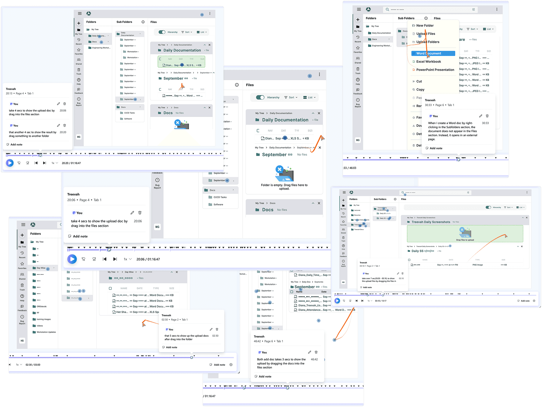
Challenge#1: System Interactive Error
Users frequently reported system errors during common actions such as creating folders, dragging files, and uploading content.
Problem Finding
Repeated Actions Triggering System Errors, Not a Performance Issue
Frequent repeated actions during system processing led to elevated rage click rates, as users received no feedback and assumed their actions had failed.
Analyzed user session recordings and compared user behavior with developers and internal users, who did not experience the same issues.
Observed that errors mainly occurred when users repeated the same actions during system processing.
Each action required approximately over 3 seconds to complete, but no feedback was provided during this time.
As a result, users assumed the system failed and retriggered the same actions, leading to errors.
Hypothesis
Testing
System Feedback Reduced Repeated Actions and Improved User Patience
Beyond analyzing spreadsheet overlaps and duplicated data points, I also conducted contextual observation during pre- and mid-meeting workflows.

→Before Meeting: Manually Prepare
Manually consolidate metrics from various sheets and platforms
Adding up to an hour of prep time
→During Meeting: Frequent Platform Switching
Frequent platform switching disrupted the flow of discussion
Led to referencing incorrect figures, which directly impacted decision-making.
Solution
One Page. One Role. Everything They Need.
1 page, 1 setup flow
Setup campaigns, track metrics, monitor ETH distribution, Withdrawal Page
User profile + campaign history in 1 page
Search users, check payout status, review comment logs
Auto-generated chart
Track overall ETH flow, export reports, monitor ROI

Problem Breakdown#2: Overcomplicated
From 2 Days to 5 Minutes: Simplifying Campaign Setup for Non-Engineers
From 6 steps with 2 roles and high risk — to 3 steps, fully owned by operations.
Before - 6 step, 2days
Steps:
Operations submits campaign request to engineers
Engineers receive and interpret the requirements
Manually update backend variables
Run internal tests to verify setup accuracy
Operations double-check with engineers before launch
Any changes must repeat the entire process
Risks:
High communication and labor cost
Frequent input errors
Launch delay
Engineering time spent on non-technical execution
Solution
No-Code, No Wait: A Smarter Way to Launch Campaigns
After - 3 step, 1mins
Steps:
Accesses the “Add new event” page
Default values auto-filled based on past campaign templates
One-click launch from the backend
Benefits:
Fully owned by marketing teams — no engineering needed
Higher accuracy with default logic
Setup time reduced to under 5 minutes
Scalable for different campaign types and logic conditions
Problem Breakdown#3: Exhausting
Manual Review That Took Over the Day
A process that required hours of manual effort, no filters, and zero progress tracking.

Manual noteing
Have to copy Suggest IDs by hand into a separate list to mark selections.
No categorization
All feedback was mixed together without any labels
6+ hours spent per campaign
Took half a workday after every event
Have to restart if interrupted
If the reviewer stopped midway, there was no way to resume from where they left off.
Designing the Interface Around How They Already Worked
I structured the interface to mirror those real steps, so that adoption would be natural, and the learning curve minimal.
Category-based filter(tab)
One-click decision tags
Status filter

Solution
From Manual Comment Sorting to 3-Click Filtering
Beyond analyzing spreadsheet overlaps and duplicated data points, I also conducted contextual observation during pre- and mid-meeting workflows.
Feedbacks from Observation
Screen-to-Function Mapping
Map for Dev Handoff:Making Development Predictable, Not Guesswork
To reduce miscommunication during handoff, each function and interactive component was clearly documented in a Screen-to-Function Map. This ensured consistent understanding between design and engineering teams, especially for features that were difficult to describe verbally.

Design System
Systematizing Reusable Components for a Flexible SaaS Interface
In SaaS products, where complex features often require multiple tables, charts, and interactive elements, maintaining consistency is key—but complete uniformity isn not always practical.
The design system defined reusable UI components (such as tables, dropdowns, and chart modules) that could adapt to different feature needs while staying visually consistent. This structure allowed for faster iteration, easier scalability, and better alignment between design and development teams.

Takeaways
Translating Primary Research into Actionable Design
User interviews and testing were the most critical foundations of this project.
Each role within the SaaS platform had different usage patterns and needs.
Consolidating those insights into a single structure that helps all users quickly find what they need was the core design challenge.
This process shaped not only the design system architecture but also directly impacted product usability and efficiency.
Balancing consistency and flexibility in component design allowed us to support complex features while optimizing workflows.
Found that combining prototypes with design documentation made handoffs smoother and clearer.